At surface, this seems like a simple question – but it’s also deceptively difficult to answer. The market can be defined as many different things, and there are actually over 100,000 publicly traded companies in the world to choose from. Luckily, the use of a stock market index can help define a particular market, as well as track its performance in a way that is easy to reference.
Types of Indices
Today’s infographic from StocksToTrade.com defines a stock market index as a thermometer that measures the health of a group of stocks. When this particular group of stocks changes in value, the index follows it along. A stock market index can track a group of stocks based on several different factors: Global: Some indices, such as the MSCI All-Country World Index, aim to be a proxy for all global equities. Regional Geography: A stock market index can also track a specific region, such as Europe. As an example, the EURO STOXX 50 tracks the performance of the largest and most liquid 50 stocks in the Eurozone. National: Indices can also serve as a proxy for the performance of an entire country’s equities. The FTSE 100 in the United Kingdom tracks the 100 largest companies traded, which total to 81% of the total market capitalization of the exchange. Industry: A stock market index can try to track the performance of an industry as a whole. The GDXJ, for example, is an ETF based on an underlying index that tracks the performance of smallcap mining companies focused on gold and silver. Exchange: Indices also are used for specific exchanges. The S&P/TSX Venture Composite Index, for example, is used to represent the performance of companies that trade on the TSX Venture exchange in Canada.
Main Indices in the U.S.
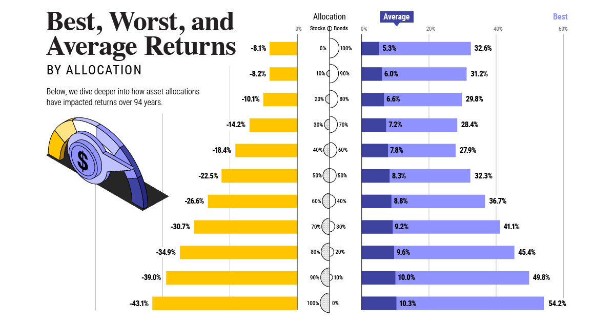
Last year we did a graphical primer of the differences between the main indices and exchanges in the U.S., but we’ll summarize the major indices here as well. S&P 500: First calculated in 1923, the S&P 500 covers the largest companies on the NYSE and Nasdaq exchanges in the United States, and represents $21.4 trillion in value. Dow Jones Industrial Average: The DJIA is a price-weighted index of 30 significant companies traded on the NYSE and Nasdaq. It has a market capitalization of approximately $6 trillion, and was founded back in 1885. Nasdaq Composite: Used more as a proxy for the technology industry, this index tracks 3,000 equities on the Nasdaq exchange, worth $6.8 trillion. It does include some companies not located in the U.S. Interested in learning more about exchanges and indices? See the 20 largest stock exchanges in the world. on Last year, stock and bond returns tumbled after the Federal Reserve hiked interest rates at the fastest speed in 40 years. It was the first time in decades that both asset classes posted negative annual investment returns in tandem. Over four decades, this has happened 2.4% of the time across any 12-month rolling period. To look at how various stock and bond asset allocations have performed over history—and their broader correlations—the above graphic charts their best, worst, and average returns, using data from Vanguard.
How Has Asset Allocation Impacted Returns?
Based on data between 1926 and 2019, the table below looks at the spectrum of market returns of different asset allocations:
We can see that a portfolio made entirely of stocks returned 10.3% on average, the highest across all asset allocations. Of course, this came with wider return variance, hitting an annual low of -43% and a high of 54%.
A traditional 60/40 portfolio—which has lost its luster in recent years as low interest rates have led to lower bond returns—saw an average historical return of 8.8%. As interest rates have climbed in recent years, this may widen its appeal once again as bond returns may rise.
Meanwhile, a 100% bond portfolio averaged 5.3% in annual returns over the period. Bonds typically serve as a hedge against portfolio losses thanks to their typically negative historical correlation to stocks.
A Closer Look at Historical Correlations
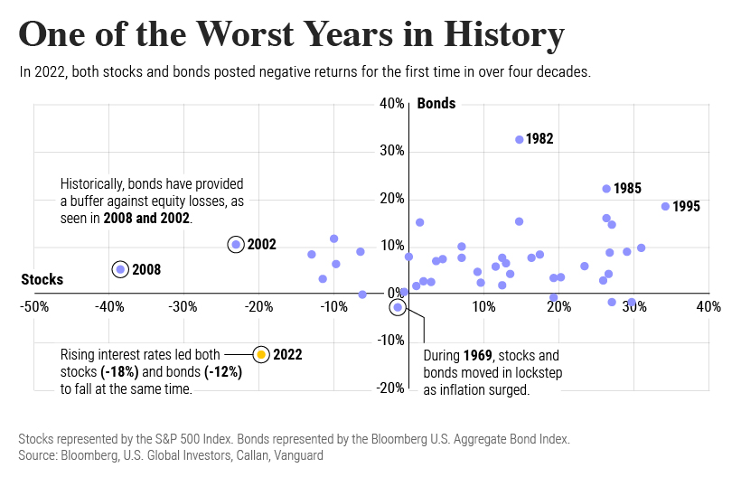
To understand how 2022 was an outlier in terms of asset correlations we can look at the graphic below:
The last time stocks and bonds moved together in a negative direction was in 1969. At the time, inflation was accelerating and the Fed was hiking interest rates to cool rising costs. In fact, historically, when inflation surges, stocks and bonds have often moved in similar directions. Underscoring this divergence is real interest rate volatility. When real interest rates are a driving force in the market, as we have seen in the last year, it hurts both stock and bond returns. This is because higher interest rates can reduce the future cash flows of these investments. Adding another layer is the level of risk appetite among investors. When the economic outlook is uncertain and interest rate volatility is high, investors are more likely to take risk off their portfolios and demand higher returns for taking on higher risk. This can push down equity and bond prices. On the other hand, if the economic outlook is positive, investors may be willing to take on more risk, in turn potentially boosting equity prices.
Current Investment Returns in Context
Today, financial markets are seeing sharp swings as the ripple effects of higher interest rates are sinking in. For investors, historical data provides insight on long-term asset allocation trends. Over the last century, cycles of high interest rates have come and gone. Both equity and bond investment returns have been resilient for investors who stay the course.
