With real estate in particular, every county is different and value may be relative depending on the area in question. A ranch that seems expensive to a farmer in Nebraska may be a drop in the bucket for a lawyer from Manhattan. Today’s interactive chart from Overflow Data shows median home values plotted against median household income, which helps give you a feel for where the least affordable housing in the U.S. is located. It’s also worth noting that in this visualization, that data comes from the ACS 2011-2015 5 year estimates from the U.S. Census Bureau.
Expensive by any Measure
The least affordable housing in the U.S. falls into two categories: places that you would expect (San Francisco, New York City) and counties that may be off your radar, such as a few in Massachusetts, Washington, or Wyoming. The Bay Area, not surprisingly, has some of the least affordable housing in the country – both in absolute terms, and in terms relative to income. There is no shortage of anecdotes for the madness occurring in San Francisco and the surrounding area, and the data reflects that. In San Francisco proper, the median home value is $800,000 with a median income of $81,000, giving a price-to-income ratio of 9.8. Meanwhile, in Silicon Valley, housing is nearly as pricey, but many people are able to make up for it with higher incomes: San Mateo County has a ratio of 8.3, and Santa Clara County has a ratio of 7.3. New York City, with its five boroughs, is also interesting to look at. Here they are ranked by price-to-income: Brooklyn is the most expensive borough based on price-to-income, just nudging out Manhattan. The Bronx also has some of the least affordable housing in the country, mainly due to lower income levels than the rest of the city.
Pricey Enclaves
As mentioned before, states like Wyoming, Massachusetts, Colorado, and Washington also have counties that are quite expensive in terms of price-to-income.
Teton County, Wyoming: 9.1 (House value: $689,000, Income: $75,000) Pitkin County, Colorado: 8.7 (House value: $621,000, Income: $71,000) San Miguel County, Colorado: 9.1 (House value: $513,000, Income: $56,000) Nantucket County, Massachusetts: 10.7 (House value: $903,000, Income: $84,000) Dukes County, Massachusetts: 10.3 (House value: $661,000, Income: $64,000) San Juan County, Washington: 8.3 (House value: $466,000, Income: $56,000)
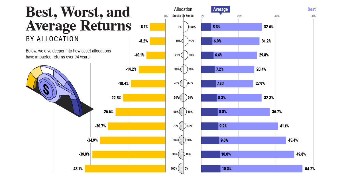
Many of these, such as Teton County or Pitkin County, are located in the mountains. Others, like the San Juans or Nantucket are made up of beautiful islands that are relatively close to major cities – in this case, Seattle and Providence/Boston respectively. on Last year, stock and bond returns tumbled after the Federal Reserve hiked interest rates at the fastest speed in 40 years. It was the first time in decades that both asset classes posted negative annual investment returns in tandem. Over four decades, this has happened 2.4% of the time across any 12-month rolling period. To look at how various stock and bond asset allocations have performed over history—and their broader correlations—the above graphic charts their best, worst, and average returns, using data from Vanguard.
How Has Asset Allocation Impacted Returns?
Based on data between 1926 and 2019, the table below looks at the spectrum of market returns of different asset allocations:
We can see that a portfolio made entirely of stocks returned 10.3% on average, the highest across all asset allocations. Of course, this came with wider return variance, hitting an annual low of -43% and a high of 54%.
A traditional 60/40 portfolio—which has lost its luster in recent years as low interest rates have led to lower bond returns—saw an average historical return of 8.8%. As interest rates have climbed in recent years, this may widen its appeal once again as bond returns may rise.
Meanwhile, a 100% bond portfolio averaged 5.3% in annual returns over the period. Bonds typically serve as a hedge against portfolio losses thanks to their typically negative historical correlation to stocks.
A Closer Look at Historical Correlations
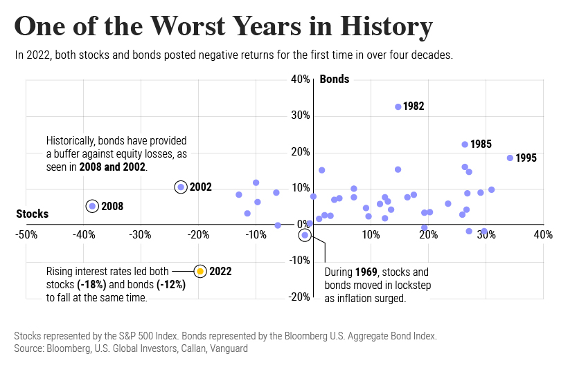
To understand how 2022 was an outlier in terms of asset correlations we can look at the graphic below:
The last time stocks and bonds moved together in a negative direction was in 1969. At the time, inflation was accelerating and the Fed was hiking interest rates to cool rising costs. In fact, historically, when inflation surges, stocks and bonds have often moved in similar directions. Underscoring this divergence is real interest rate volatility. When real interest rates are a driving force in the market, as we have seen in the last year, it hurts both stock and bond returns. This is because higher interest rates can reduce the future cash flows of these investments. Adding another layer is the level of risk appetite among investors. When the economic outlook is uncertain and interest rate volatility is high, investors are more likely to take risk off their portfolios and demand higher returns for taking on higher risk. This can push down equity and bond prices. On the other hand, if the economic outlook is positive, investors may be willing to take on more risk, in turn potentially boosting equity prices.
Current Investment Returns in Context
Today, financial markets are seeing sharp swings as the ripple effects of higher interest rates are sinking in. For investors, historical data provides insight on long-term asset allocation trends. Over the last century, cycles of high interest rates have come and gone. Both equity and bond investment returns have been resilient for investors who stay the course.
